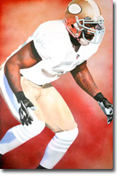
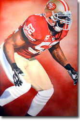
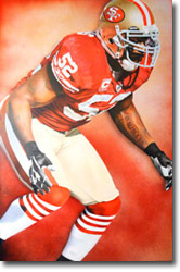
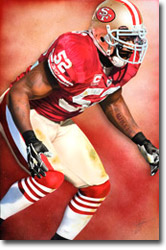
Throughout the following images I’ll walk you through my process of creating this painting of San Francisco 49ers linebacker, Patrick Willis.
Step 1:
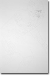
Each painting starts with a pencil sketch. The sketch doesn’t need to be a complete rendering but rather more of a map for where and how to apply paint. The key is to make sure that the subject’s likeness and proportion is correct.
Step 2:
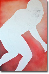
A rule of thumb is to always work the background before starting the subject matter. I don’t follow this rule every time but in this case, it made sense due to the sharpness and focus that the image required. Patrick was masked off with tape in order to spray the background without overspray reaching the most important areas of the painting. Most of my backgrounds are created using a mixture of a traditional brush and an airbrush. For this piece however, spray paint was used at my client’s request. The goal here was to capture a vivid mixture of the San Francisco 49ers colors while keeping the same soft value that the airbrush provides.
Step 3:
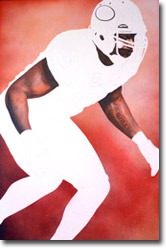
Another rule of thumb is to paint from light to dark colors. This is true because overspray, for example, onto black from white will reduce the blacks value causing you to repeat steps and costing you valuable time. As you see here though, I always like to begin my subject matter with the most important parts…the likeness and the skin tone. Not only is it more exciting to see a face come to life than the folds in a jersey but, it’s also a time saver because if you spend hours getting everything right only to ruin the painting by not capturing the likeness precisely you’ve wasted not only your time but valuable resources and equipment. Some images show more facial detail than others. In this photo, most of Patrick’s face is covered in shadows but there is a slight glare above his eyes, which you’ll notice more in later stages, from his visor. Most of my time spent at this stage was on attaining the proper musculature and color value of the tattoos.
Step 4:
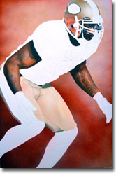
Once the skin is completed I go back and abide by the rule of painting from light to dark. It worked well here because you’ll notice a light mist of red in his pants. This, for the most part, is just an embellished shine or reflection from the jersey color. It would’ve been difficult to reverse this had I started with the jersey and accidentally over sprayed too much red onto the pants. Where as, over spraying the gold into the jersey’s space can easily be corrected by applying the darker color on top of the lighter.
Step 5:
This part can be tricky. Laying down paint on numbers that look to be white against the color of a dark jersey is difficult. You have to take into account the fact that colors are affected by their surroundings. A common mistake is to use just a simple grey to create the shadows of folds. It’s much more complex than that because using just one color won’t capture the different values of whether a color is warm or cool. Here you’ll see that the number five in the center of Patrick’s jersey is cooler on top than it is below. This is because of the shadows created by the angle of his upper body. A bluish tint on top reflects the natural daylight while the lower shade of golden brown plays off of the warm tones from the pants. A light mist of red will help blend into the jersey within the next step.
Step 6:
At this point the helmet is nearly finished. The same tone of red used in the helmet logo and stripes was my base color for starting the jersey. Once I have a base of color down on canvas I begin the process of detailing folds and shadows with either a blade or an eraser to create texture and then re spray the area to give the details value. This is an ongoing process that has to be repeated carefully as not to over saturate an area with paint. The blue you see in the socks and pants is again the same principle as the numbers from earlier. While white is an actual color, seldom will you find it in a photograph or a painting due to tints and shades created by reflections.
Step 7:
By filling in the red throughout the lower body, the blue tint starts to look more acceptable. In order to create some depth and not have the painting look too flat, I’ve added a drop shadow. This could’ve been done as part of applying the background paint while Patrick was masked in tape. I chose to do this now however, without any masking, to help soften up some of the outlines of the image. This way, it creates a softer, more natural, look rather than that of a cutout.
Step 8:
This is what I call the “Final Image” because only the smallest of details were left to finish between this photo and the last. Also, because the completed stage is always professionally photographed making it the final image that my client sees before receiving their painting. There are a number of minor things completed here such as the facemask clamps and gloves but most importantly, I took it upon myself to add the grass stains on the socks, pants and numbers. Patrick Willis, being an All Pro linebacker, should get dirty throughout the course of a game. I felt like the grass stains not only added a complimentary color to the 49ers red but also served the purpose of alluding to his toughness and involvement within the game.

